Color Theory Basics
Understanding the basics of color theory can help take your tattoos and art to the next level.
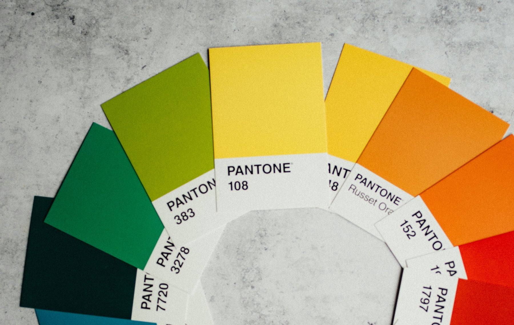
If you’ve ever taken an art or design class, you’re likely familiar with the color wheel. It's a great way to visualize how colors relate to each other. Here are a few key concepts for understanding the layout of a color wheel to make choosing colors easier:

Primary colors: base colors on a color, consisting of red, blue and yellow. These colors are mixed together to create new colors.
Secondary colors: found evenly spaced between the primary colors, and are created from mixing primary colors together. For example, orange is a secondary color made from yellow and red.
Tertiary colors: made from one primary color and one secondary color. Chartreuse is a color made from green mixed with yellow.
Colors can be divided into two categories: warm and cool. Warm tones tend to look more “inviting” or “stimulating” and are often associated with colors like yellow or red. Cool toned colors tend to recede into the background and might look more “relaxing.” Blues and greens are generally thought of as cool toned. These categories are relative though, so cool toned reds and warm reds exist depending on what side of the color wheel they are on.
Color Harmony:
Once you know how to read a color wheel, the next step is learning how to choose a color palette that works for you.
Complementary colors: Colors opposite each other on the color wheel. These are great for when you want high visual impact in your piece, but they can look too busy if used too much or over a large area.
Analogous colors: colors that sit right next to each other on the color well. Typically, you use one as a base color, another as a supporting color, and the final color as an accent. Since there isn’t much contrast between analogous colors, you might consider adding one to create visual interest.
Triadic, split complementary, square, and tetradic color schemes: uses the evenly spaced position of colors on the wheel to find color harmony. With these color schemes, paying attention to warm and cool colors is a must, but can achieve great results.
Achromatic: uses exclusively black, white and grey shades.
Monochromatic: utilizes one hue and creates a color story based off of different tints and shades of that hue.
We hope this basic guide provides a good starting point to understanding color theory, and how to make color choices in your work that provide the best payoff for you and your client.